What's new
Roleplay UK

Join the UK's biggest roleplay community on FiveM and experience endless new roleplay opportunities!

  • The Official Roleplay UK 10 year pin badge has arrived, get one for yourself here 5 left!

bring back the old car menu and clothing and animation menu

Status
Not open for further replies.

Dont Look At Me

Well-known member
Location
israel
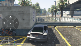
As for 16/8 (August) the car menu and interactions menu has changes to something new, (when holding caps) i feel like getting used to a new menu system which isnt really bringing a new experience to the game will be hard to get adjusted to, also, for me as a person who wears sunglasses its kinda hard to read the vehicle menu for example, as there are ALOT of options which you need to read in small letters, but that is just a personal experience of mine.

Basically, id like it if the interaction menu (Holding CAPS LOCK) will be changed back, as alot of people got used to it for months now, and with all due respect the new menu isnt really bringing anythings new that cant be achieved by simply using /me (to carry players or show license)  or by using F1 (for animations), to me the new menu is simply more complex, thanks for your time if your read it all, and hopefully we're sharing the same idea 🙂

BDW- the new emote options are great.

please Up or Down vote, depending on your opinion.
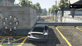
Desktop Screenshot 2020.08.16 - 17.44.52.05.png

Desktop Screenshot 2020.08.16 - 17.44.49.53.png

 
The new menu is fantastic, especially for Factions since it concatenates all their menus into one

A big  -1 from me, I hated having so many options before and this new menu is clearer - only point I'd make is that the text could be bigger, it's impossible to read on my 4k monitor so have to basically go off the icons

 
Last edited by a moderator:
yh clearly this seems like a hactic and the complications are real, the old caps menu was way to ez to interact with

 
@Norman Understandable, yet when one button is controlling way too many options and interactions you get lost and barely adjust to it, atleast for me, when you know where each interaction is it is easier to manage what you want to do.

 
@Norman Understandable, yet when one button is controlling way too many options and interactions you get lost and barely adjust to it, atleast for me, when you know where each interaction is it is easier to manage what you want to do.
I think change and optimisation is a natural part of good development -  yes you may have to re-learn where things are but this makes life a lot easier for future players having all the options centralised.

 
I appreciate your feedback and have taken it into thought with the changes I am making. I have increased the size of the text and menu for players as it seemed to be a issue, this menu was changed as it is more customizable. We are always working hard to make our systems the best. Cheers.

Archie

 
I think this menu can work but what its done to animations and certain features really sucks.

E.G. No more being able to swap seats. Animations now being a huge list to scroll through if you dont know the chat command, instead of there being like 20 key/most used ones on the wheel and the rest in a menu.

I'd say this one will be fine when it has tweaks

 
@ash47 tbh the emotes are great, ive noticed that when you use an emote lets say "lean" , and then leave the emote menu and go back to it the last emote you used will still be shown, also u might want to memorize where each category of each emote is located, for example lean is 144/355 

 
@Dont Look At Me thanks for taking your time to make this suggestion however it is clear from the votes that the community doesn't want to revert to the old system and so this will be rejected. Some changes have been made to the wheel for the next update.

 
Status
Not open for further replies.
Back
Top